
Generate 2012
OK, here we go again. I had this post all typed up once before, and WordPress ate it. That’s right. Just…. ate it. So, this version will be a lot shorter and less detailed.
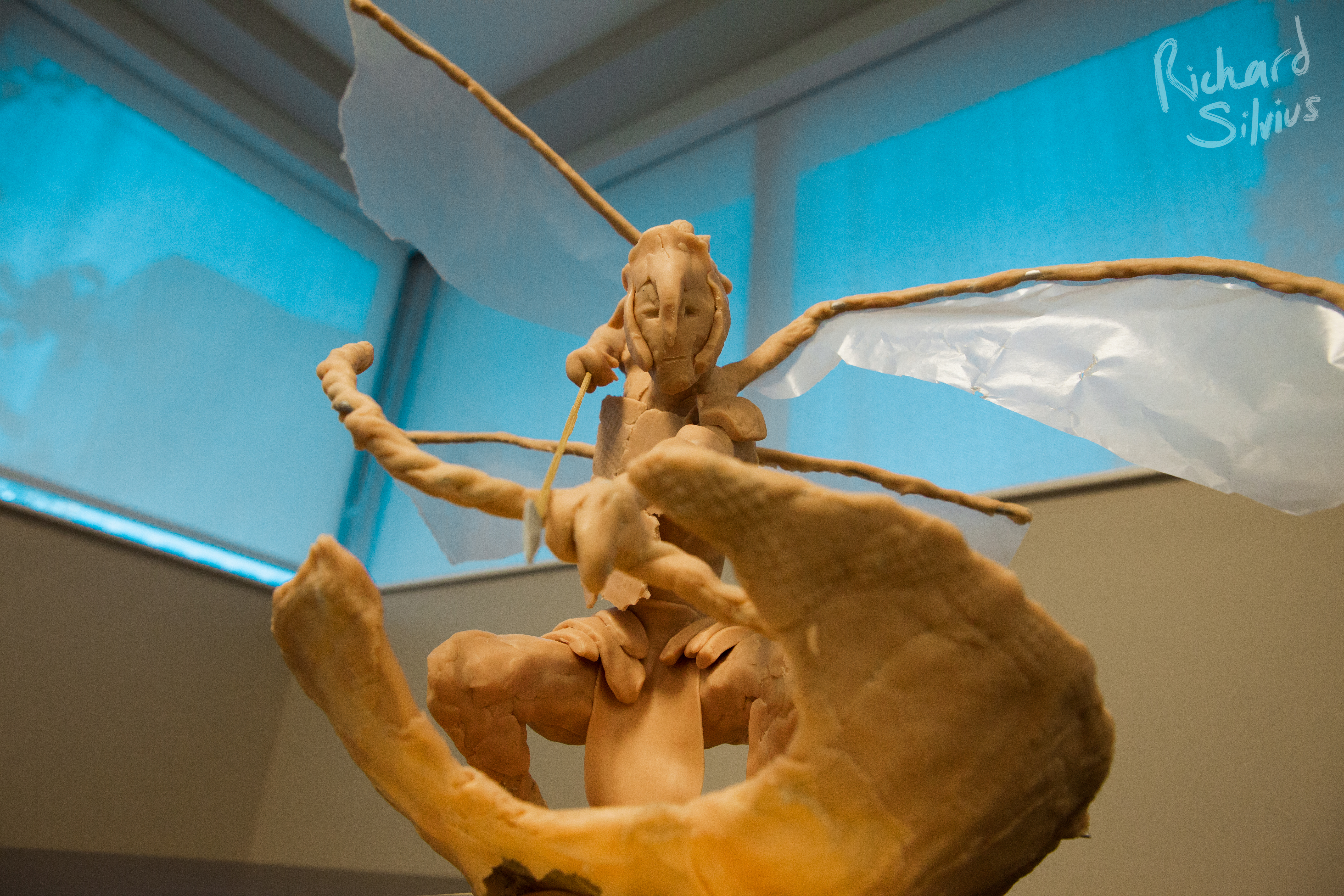
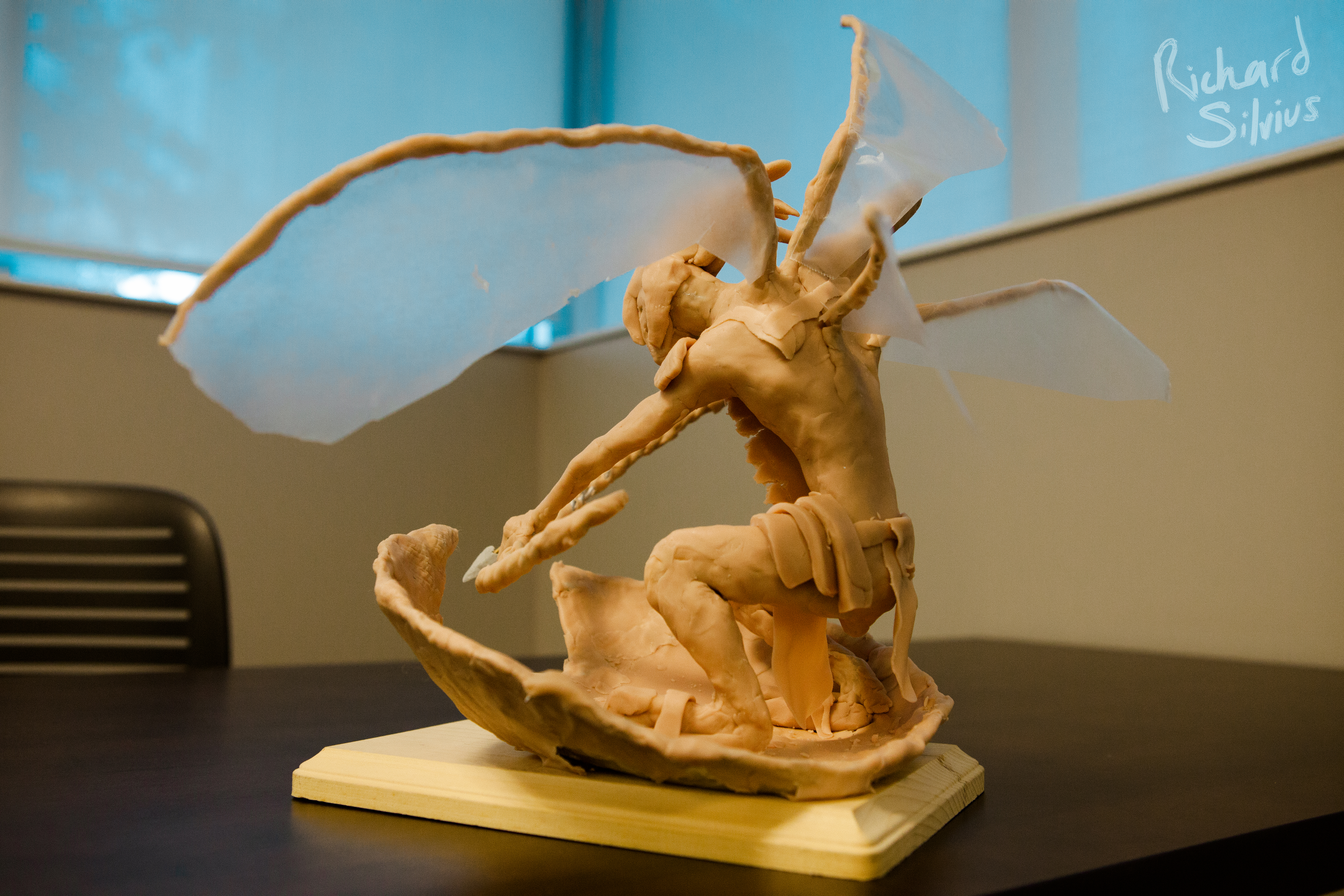
Anyway, a little over a week ago I had the opportunity to participate in a unique annual challenge hosted by the Savannah College of Art and Design. This year, they combined us animators with the ITGN department. (I know they do game design, what the hell ITGN actually stands for — remind me to ask one of them.)
Our challenge was to design an alien species that had both animal and human characteristics, and possessed bronze age equivalent technology. The deliverables included a Z-Brush model, an illustration showing the creature in its environment, and a physical maquette. We worked in groups of three, with one person assigned to each of these tasks.
The highlight of the even was the opportunity to get feedback from the guys at Hi-Rez Studio, and from Scott Spencer, a Z-Brush prodigy and SCAD alum currently working with WETA on Jackson’s Hobbit.
Scott’s first round of feedback on our design was charitably supportive — but it was clear he did not like the direction we were going, and he felt we had focused too much on a certain prop as opposed to the character we were supposed to be designing. And he was absolutely correct. Still, it proved a setback as we tried to revisit our design and align it to what we thought he wanted. To make a very long story short, after about 8 hours of getting nowhere, one of my team “phoned a friend”, an incredibly talented guy who was able to knock out some drawings that Scott loved, and finally get us moving again.
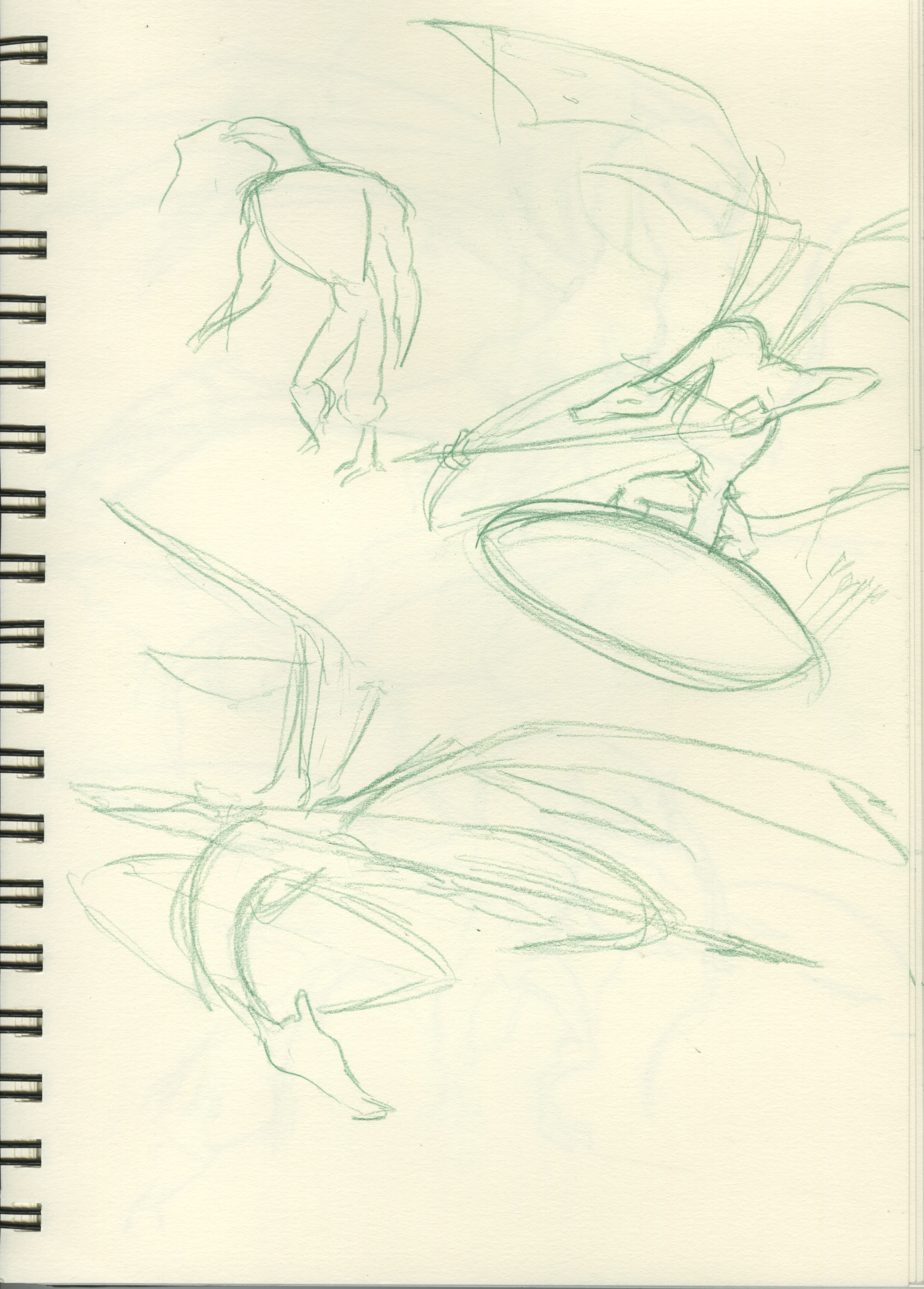
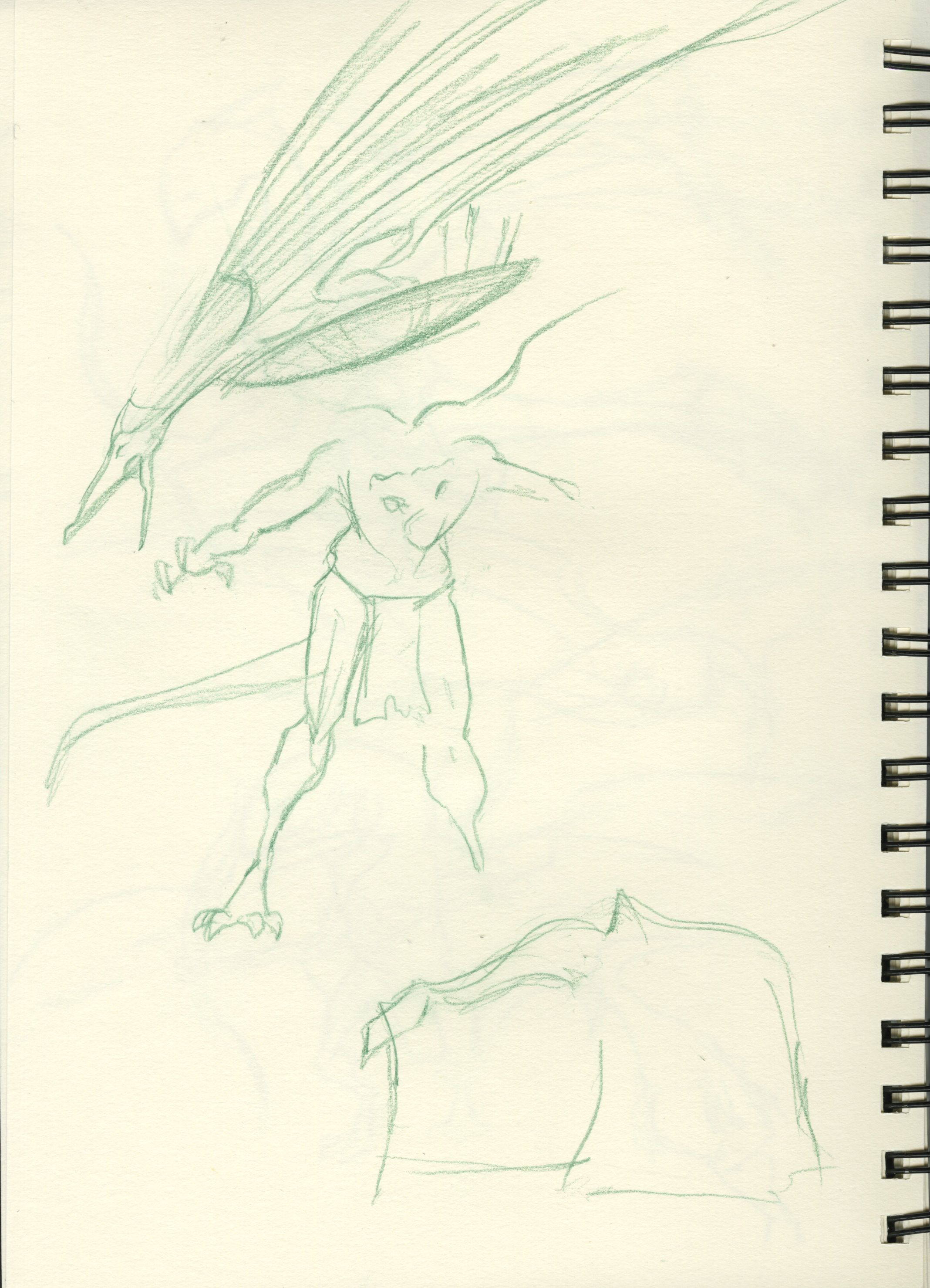
My task ended up being the maquette. I had never done one of these so it was a unique challenge. Considering the time and experience handicap, I think it came out quite well. The gallery includes some of the early sketches I did for our design, and some pics of the “finished” (as in, ran out of time to keep working) maquette.


Crow’s Nest Sneak Peek
I have taken down almost every video related to my senior film (in order to maximize eligibility for film festivals), but I’ve been getting a lot of requests to see what I’ve been working on — so — here’s a sample!
I have been working on this scene for days — it’s turned out to be one of the most challenging scenes in the film. While I am not totally happy with it, it is “acceptable” enough for me to move on to another scene. I have a lot of work left to do on this film and only a few more weeks to do it in!
[vimeo 51032762]Fire!
This is precisely why I ALWAYS have a camera with me.
On my way to school, I passed by this conflagration, and of course, my inner photojournalist could not NOT get out of the car and shoot.

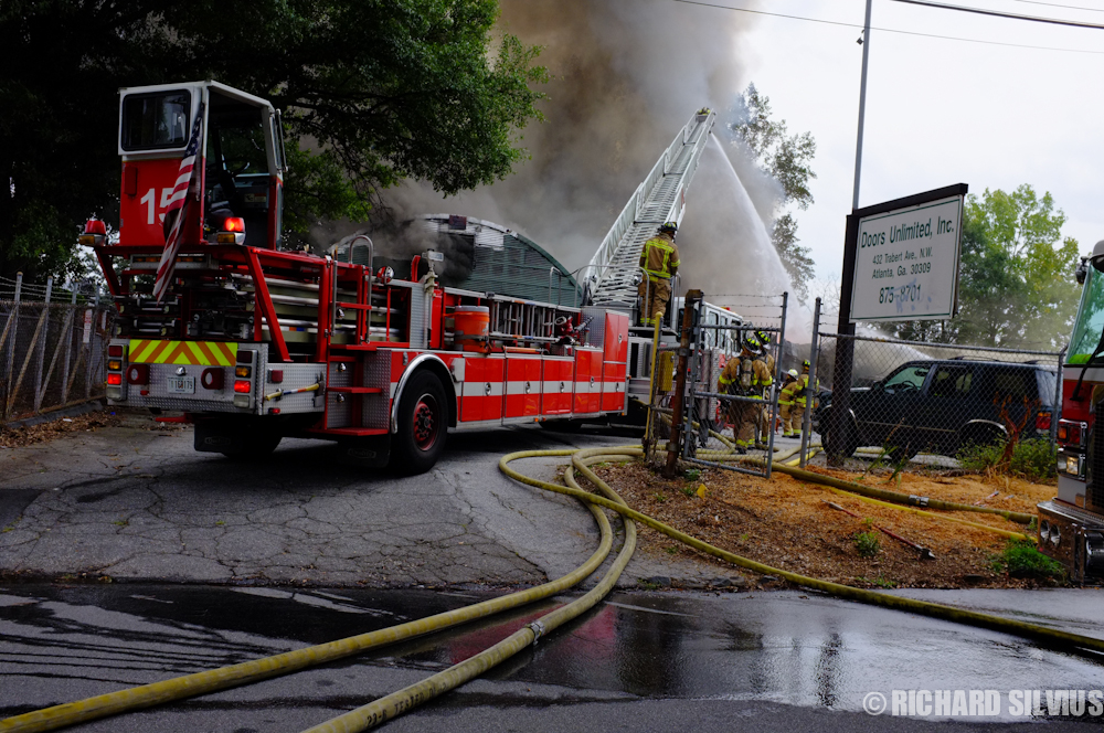


Here are the grisly details:
http://www.ajc.com/news/atlanta/business-burns-near-atlantic-1498879.html
Earliest Animations
I’ve been digging through my material again, getting ready to update that “temporary” reel I’ve had posted for, probably over a year now…
In the process I came across some animation I did a LOOOONGGG time ago. WAY before I ever even decided to become an animator. Hell, before I decided to go to college!
They are pretty damn absurd… especially “Titties”. *siiigh* I was so mature for my age….
Needless to say, these will NOT be appearing on the new demo reel!!
Pirate from my upcoming film, “Crow’s Nest”

It’s a ruff sketch of the main character for my senior film. Right now I am working on fine-tuning his design and completing his turnaround.
“The Follower” Short Film
This quarter has been mad as I have been working on two films at the same time.
One of them is an abstract bio-pic about the relationship between Charles Manson and his followers. I’ve been lucky enough to do the character design, storyboards and animatics for this film. I’ve really enjoyed working on it, even though I’ve had to start over again four or five times now — as my team and I have honed the story.
Originally, we had wanted to use “Helter Skelter” by the Beatles, or something very similar to it — our idea evolved though, and when we discovered that Manson’s own music was available under the creative commons license, we decided to try that. I think the new music selection makes the film a lot creepier. Especially the lyrics in the beginning, when the title is revealed “A little bit will go a long way, I’m sure… and I’m here to reassure you…”
Just the thought of Manson reassuring someone is…. chilling, really.
Here’s the animatic:
Please check out the website for our film at http://www.thefollowershort.wordpress.com
Morning Warm-Up Doodle
I have an overwhelming amount of work to do today, so I thought it would be a good idea to do a random drawing to get me started. This is an interpretation of a character from Stephen Silver’s Excellent Posebook app.
I just did three quick passes, overlaying one on the other, pushing the character further each time.

Character Design Work from Nickelodeon, Part 2

One of the perks (and there are MANY) of being an intern at Nickelodeon Animation was a 6 – week character design class with Joel Fajnor, the art director of “Kung-Fu Panda: Legends of Awesomeness“.
My peers and I were given a choice between designing a Horned-Toad Janitor or a Motorcycle-cop Cow. I went with the Horned Toad! Here are some images that chronicle the creation of this character, from start to finish!
Assignment #1 was to complete 20 ruffs — each totally different from the last. The challenge was to keep in mind all the various principles of design — large/medium/small, straights against curves, basic shapes, etc. Like most of the class, I was only partially successful. Joel pointed out our tendency to “even things out” — for example — making the head the same size as the body — as was the case in my first pass at the above character.


During class, Joel critiqued our designs. Mine were pretty much narrowed down to the three right above — which coincidentally happen to be the first three drawings I made. Hmmmm.. As you can see the fat one in the middle is the precursor to my final design — but he is too evenly proportioned. The next step was to make silhouettes of him, and try to push the design that way:


The Silo drawings make it PAINFULLY obvious how bland my first drawings actually were… this method proved to be invaluable… I don’t think I would want to approach designing a character without going through a silhouette pass ever again.
The next job was to start on our turnarounds, which you saw. Finally, the last couple weeks of the class were devoted to developing extreme expressions and poses. The class selected a range of emotions that we would all draw:
1) In love
2) Angry
3) Puppy just got run over by a steam-roller
4) Finger stuck in 2,000,000,000 volt socket
5) Just won the mega-zillions über lottery
So, below is my first pass at the expressions.

It seems laughable now, but when I first drew these they seemed pretty good. Joel complimented my drawings but told me I had not gone NEARLY far enough. So, below is my second pass:

By this time, I was literally packing my bags to head back to Atlanta for school, so these were done in a big hurry. Joel pointed out that I was having trouble deciding whether or not my character was dimensional, or more in the flat style… I hadn’t thought about it, but he was right (of course). He liked how far I pushed some of them — but others he felt were beginning to get confusing.
Next up were the extreme poses. This is a FIRST PASS… so I humbly admit, it’s pretty bad. Once this quarter is out I will spend some time finessing these and re-post. But for now — it would be a shame to leave out a part of the class!

The 2,000,000,000 volt socket stayed on the list for the extreme poses. Notice that there’s no clear line of action, and the central part of the character is reall ambiguous.

This is meant to be the character falling out of an airplane. Just… not.. clear…

This is supposed to be the character pulling a 4-billion ton locomotive up a hill with nothing but a rope. the line of action isn’t quiiite right, and Joel pointed out that the arms should be stretched longer — preferably to pull them outside of the silhouette. When I look at this…. I see him straining but I don’t FEEL the pull of the locomotive… so I’ll be revisiting this along with the others.
Character Design work from Nickelodeon, Part 1
During my internship at Nickelodeon Animation, I had the opportunity to get feedback on my work from some incredibly talented individuals. Here is a practice character design test I did for Fairly Odd Parents. The show had a great, long run on Nick, so the design language is really well established and there is obviously plenty to reference. I tremendously enjoyed learning the intricacies of the Butch Hartman style of drawing — it ain’t as easy as it looks!!!
Special thanks to Gordon Hammond, Jennifer Wood, and George Goodchild who all helped me with this!!


